We're experts on how the body moves, not site builders.
We needed a partner who just got it.
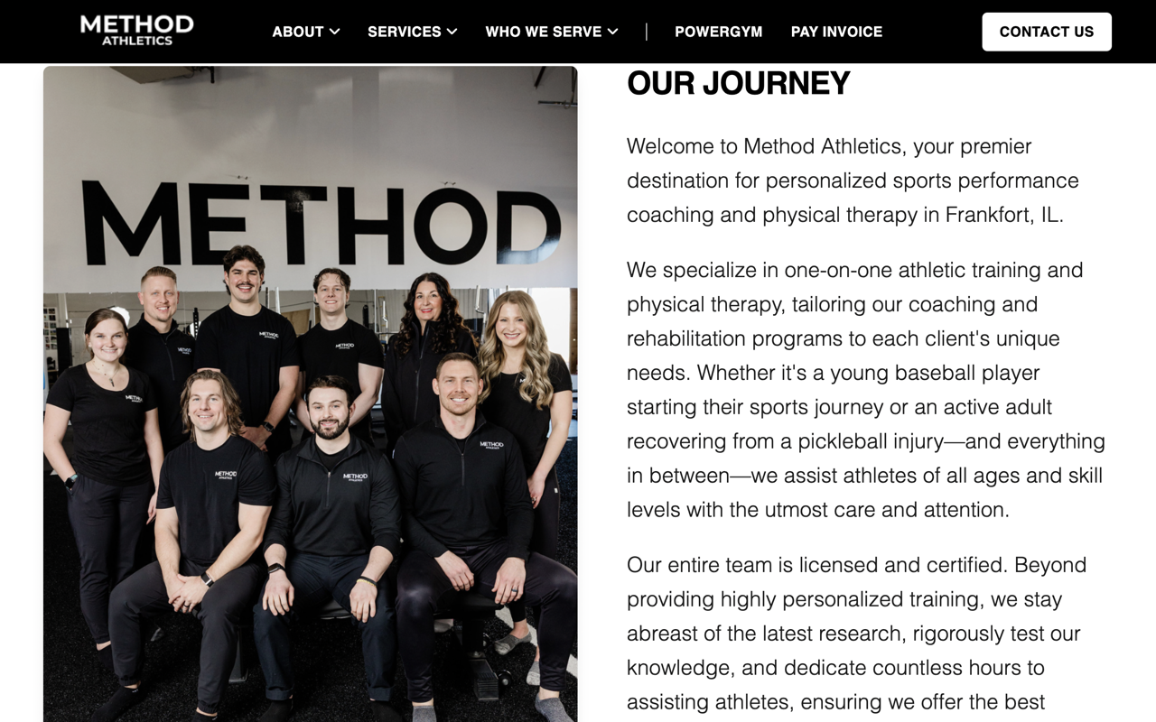
Method Athletics believes that true peak performance is achieved
by seamlessly uniting elite sports training with expert medical
rehabilitation under one roof.
The Method Athletics system is built on progression and control.
The site works because it follows the same rules. It's
structured, repeatable, and free of noise.
Highlights
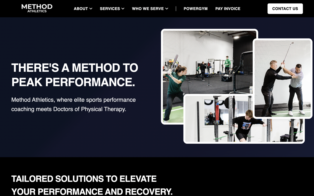
Immediate orientation
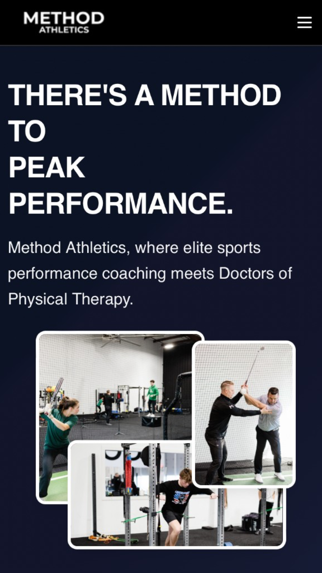
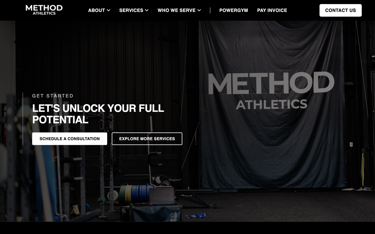
The homepage establishes Method's position right away.
The headline, subtext, and imagery all reinforce the same
core idea: the safest and most effective path to peak
athletic performance requires the combo of expert training
and evidence-based rehabilitation.
Guided progression
Throughout, page flows mirror the training model itself.
Users move from high-level overviews to specific services,
and then to detailed process guides. Each step narrows the
focus from “what this is” to “how it
works” to “how I start.”
Process made visible
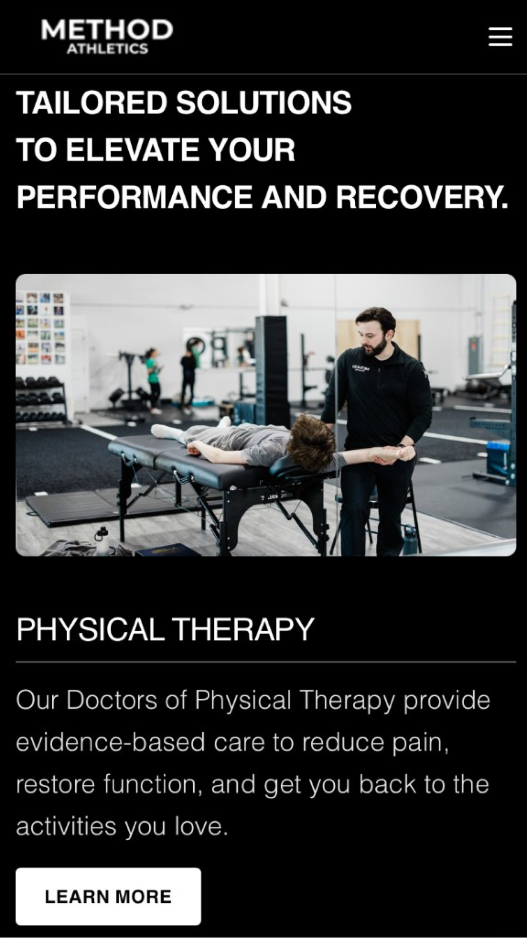
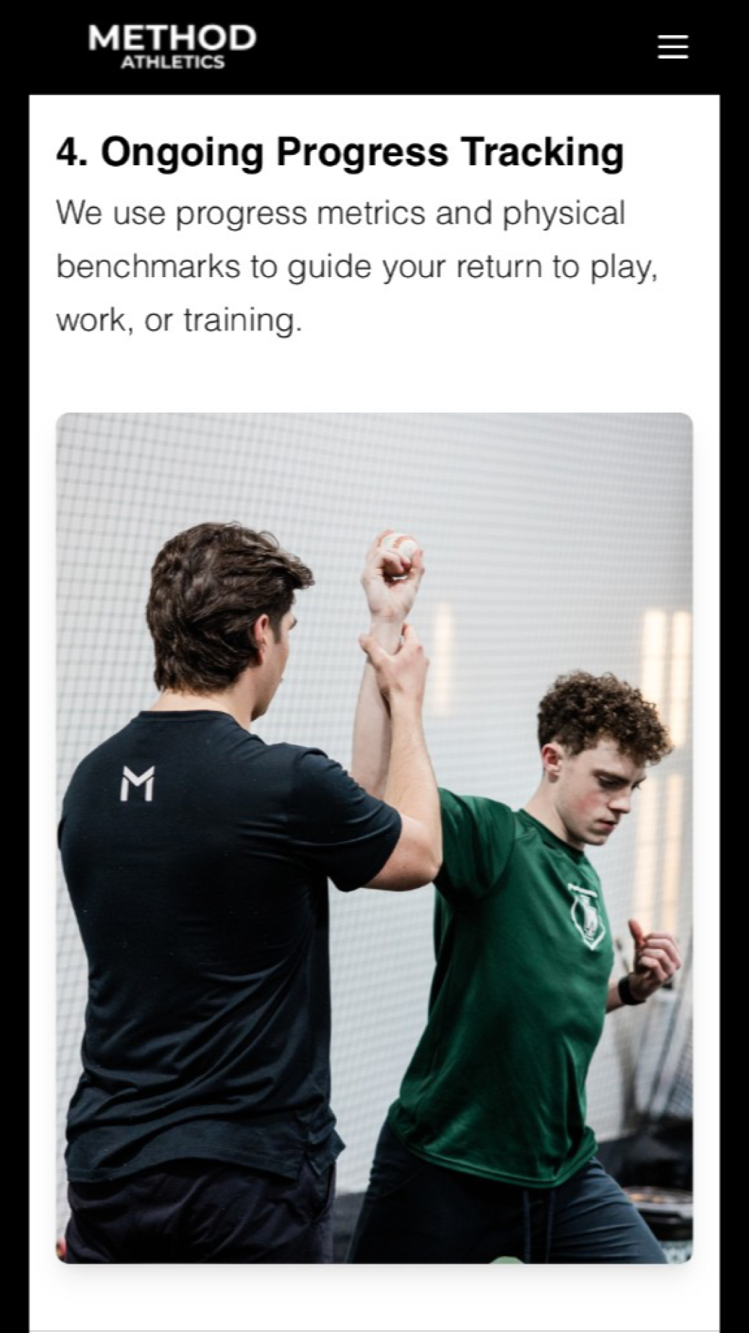
Most fitness sites imply expertise. Method shows it.
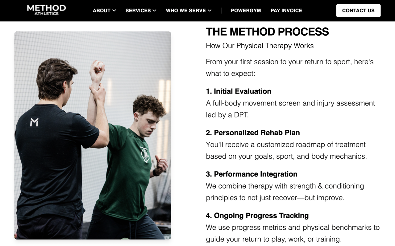
Evaluation steps, baseline metrics, and progression phases
are surfaced clearly, allowing users to see how outcomes are
produced—not just promised.
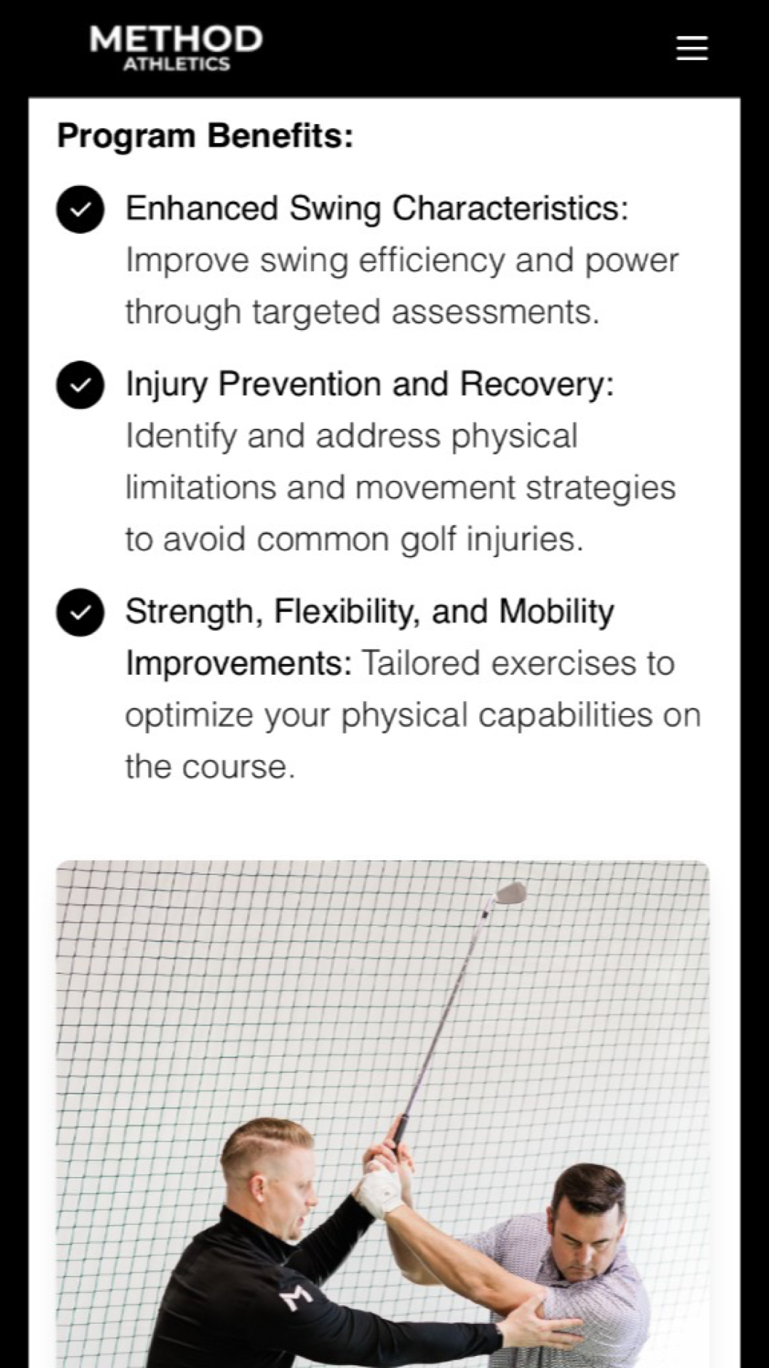
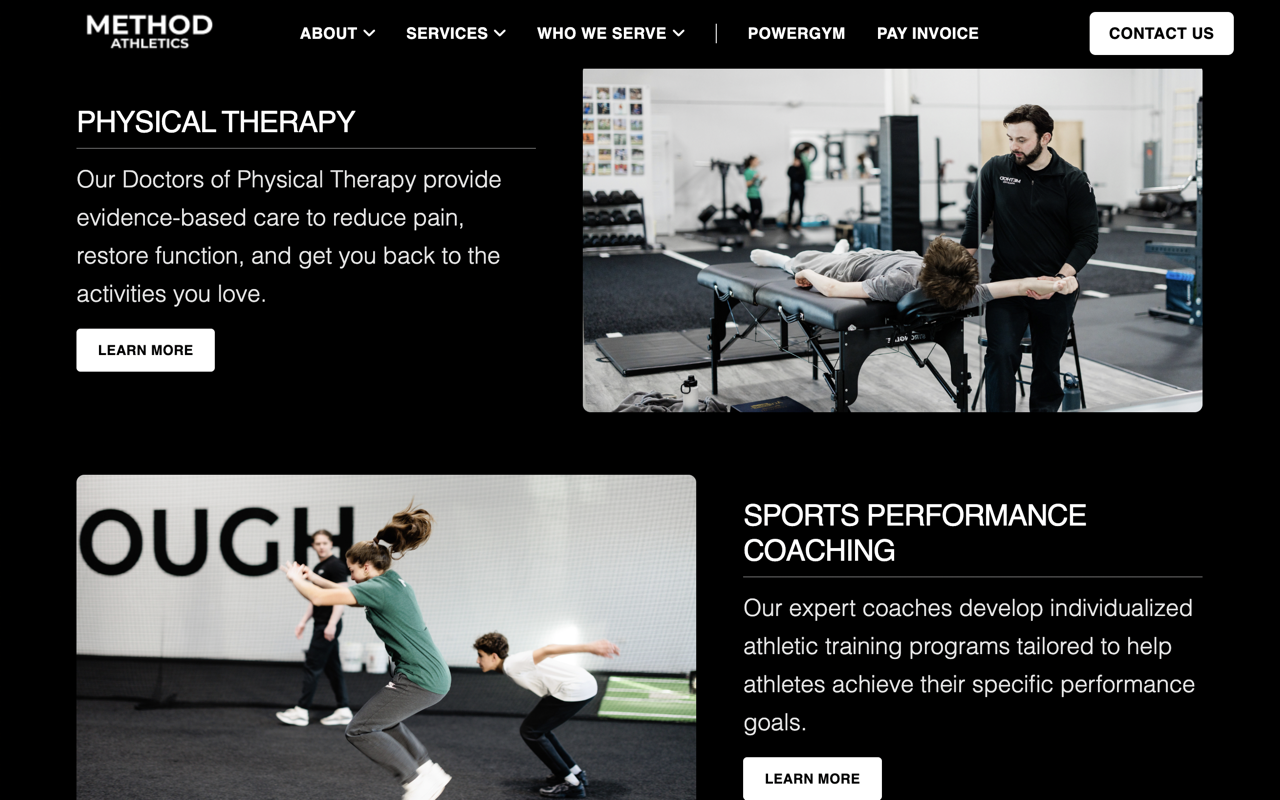
Parallel structure across services
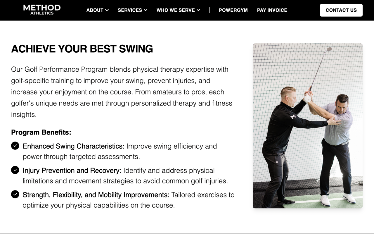
Every service page is built on the same four-step
foundation:
Define the problem
Clarify the audience
Show the method
Outline the process
Site visitors don't know it yet, but once they read
their first services page, they've already experienced
The Method. Eventually, this predictable rhythm makes
browsing effortless.
Form reinforces discipline
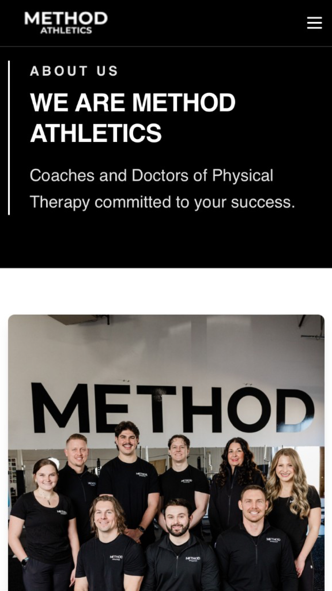
The Method team picked a black and white theme on purpose.
The visual identity is restrained—strong contrast with
minimal ornament. It signals precision and control. The
site's substance carries the weight.
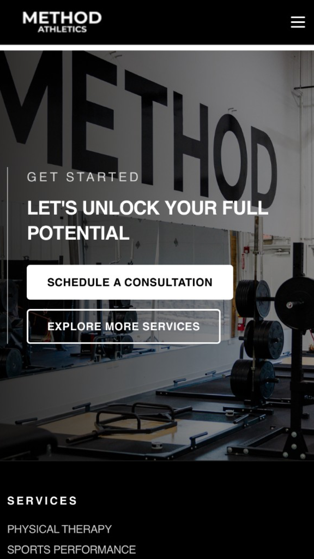
Conversion without friction
Calls to action appear at natural decision points—after
clarity, not before. By the time a user reaches
“Contact,” the question is no longer
what is this? but
how do I start?
Immediate orientation
The homepage establishes Method's position right away.
The headline, subtext, and imagery all reinforce the same
core idea: the safest and most effective path to peak
athletic performance requires the combo of expert training
and evidence-based rehabilitation.
Guided progression
Throughout, page flows mirror the training model itself.
Users move from high-level overviews to specific services,
and then to detailed process guides. Each step narrows the
focus from “what this is” to “how it
works” to “how I start.”
Process made visible
Most fitness sites imply expertise. Method shows it.
Evaluation steps, baseline metrics, and progression phases
are surfaced clearly, allowing users to see how outcomes are
produced—not just promised.
Parallel structure across services
Every service page is built on the same four-step
foundation:
Define the problem
Clarify the audience
Show the method
Outline the process
Site visitors don't know it yet, but once they read
their first services page, they've already experienced
The Method. Eventually, this predictable rhythm makes
browsing effortless.
Form reinforces discipline
The Method team picked a black and white theme on purpose.
The visual identity is restrained—strong contrast with
minimal ornament. It signals precision and control. The
site's substance carries the weight.
Conversion without friction
Calls to action appear at natural decision points—after
clarity, not before. By the time a user reaches
“Contact,” the question is no longer
what is this? but
how do I start?