Choice-driven entry
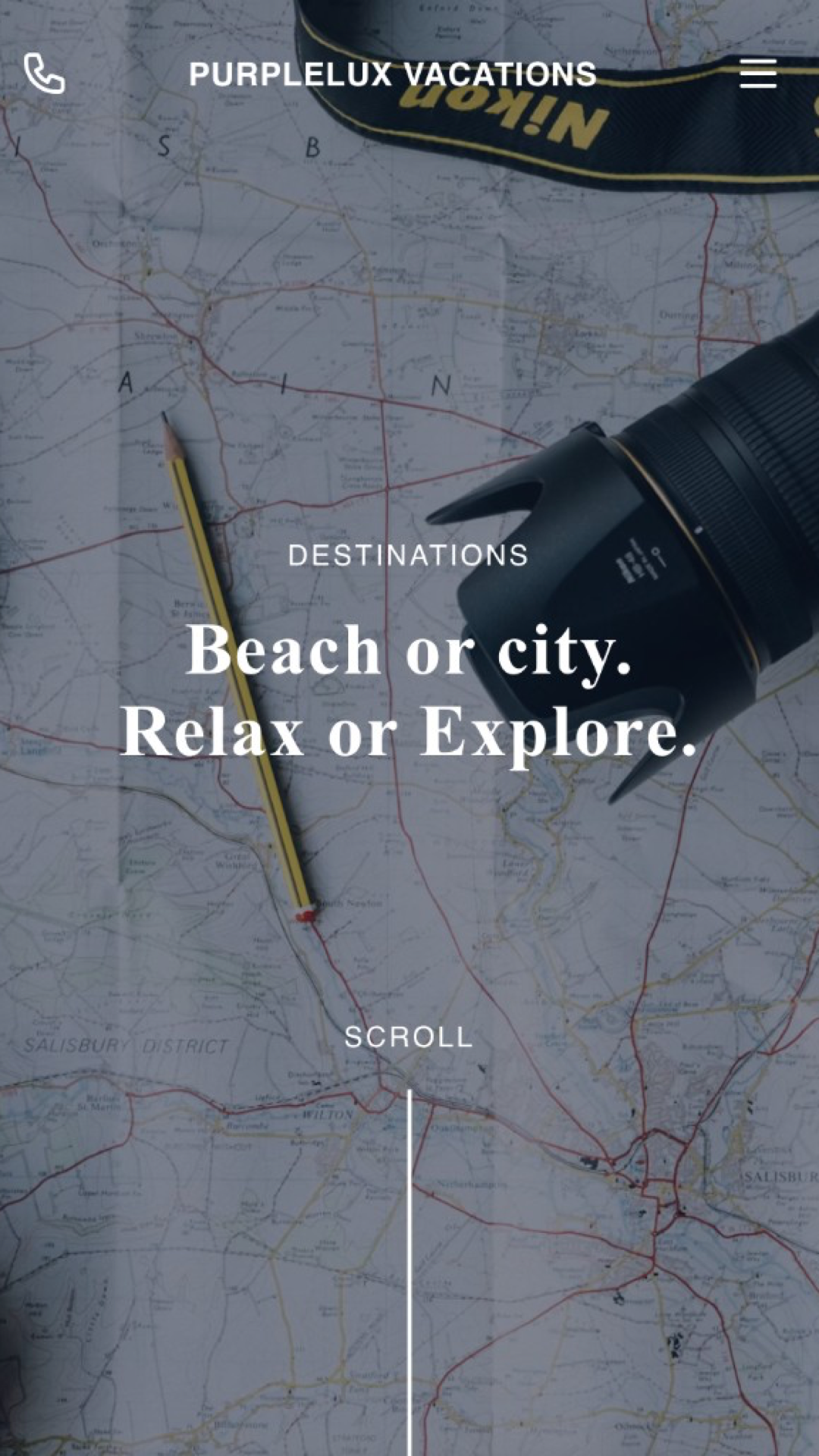
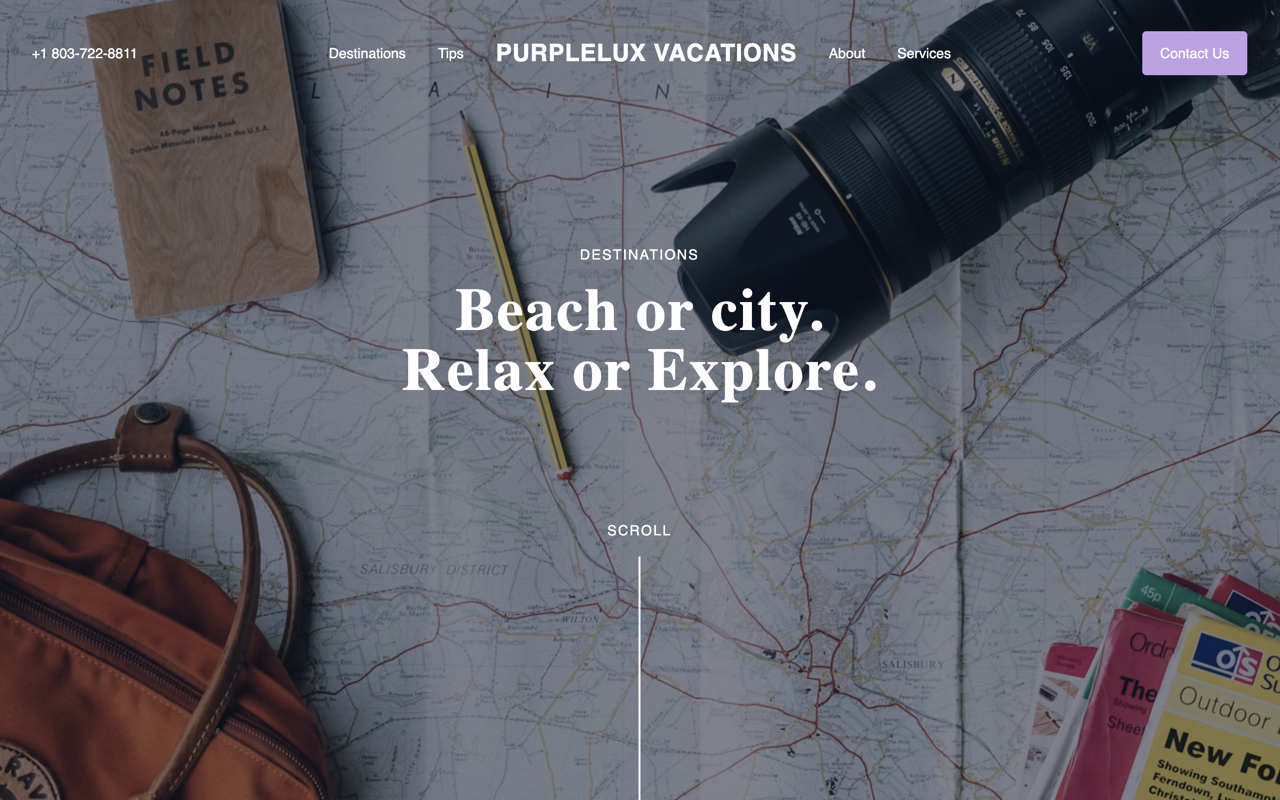
Consistently—in both direct and subtle ways—the site nudges visitors to choose. Beach or city? Relax or explore? This intentional fork in the road invites users to imagine concrete experiences without forcing any real commitment.
My clients always have luxurious travel experiences. I needed my site to feel luxurious, too.
PurpleLux Vacations sits between two extremes: rigid itineraries and unstructured travel. Their approach provides clarity where it matters—booking, budgeting, and coordination—while leaving space for experience and spontaneity.
The site is built to mirror that balance. It leads with exploration, then introduces structure gradually, allowing users to move from inspiration to planning without friction.
Consistently—in both direct and subtle ways—the site nudges visitors to choose. Beach or city? Relax or explore? This intentional fork in the road invites users to imagine concrete experiences without forcing any real commitment.
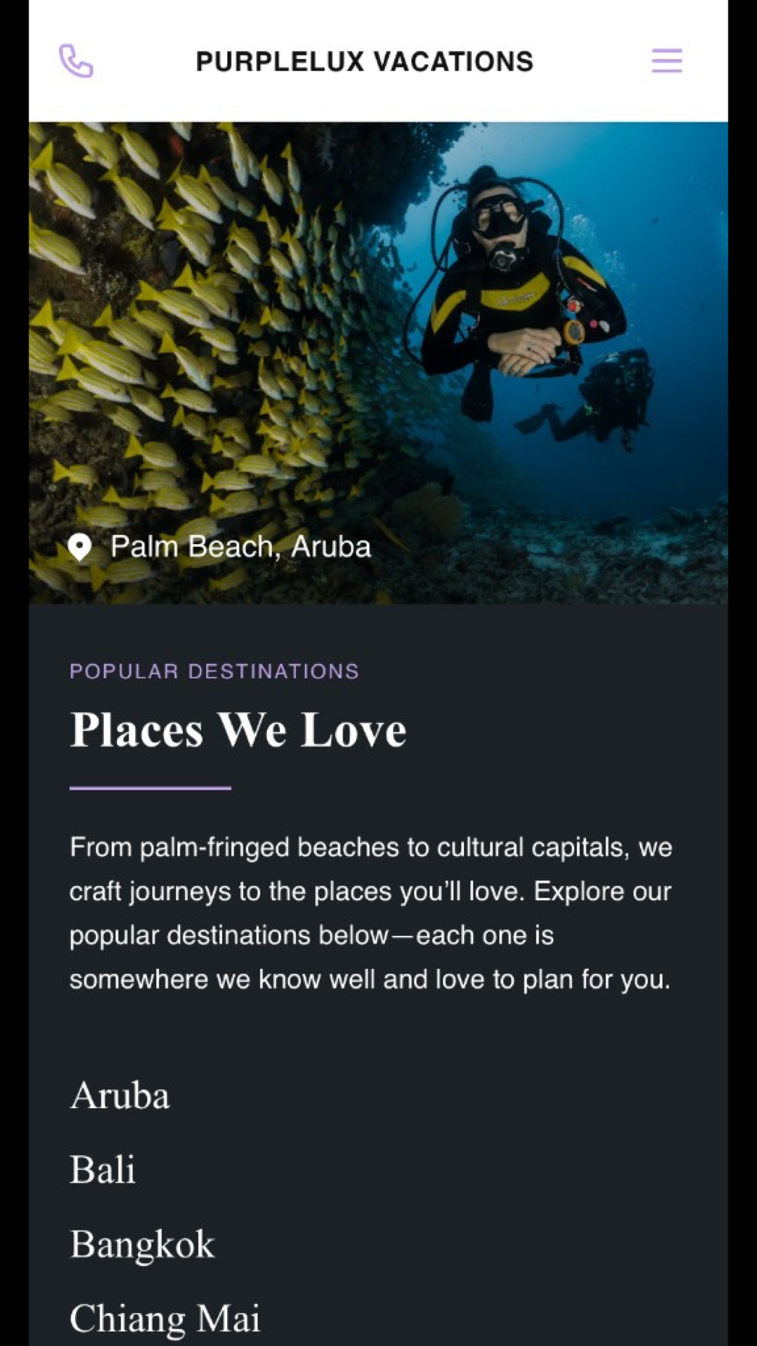
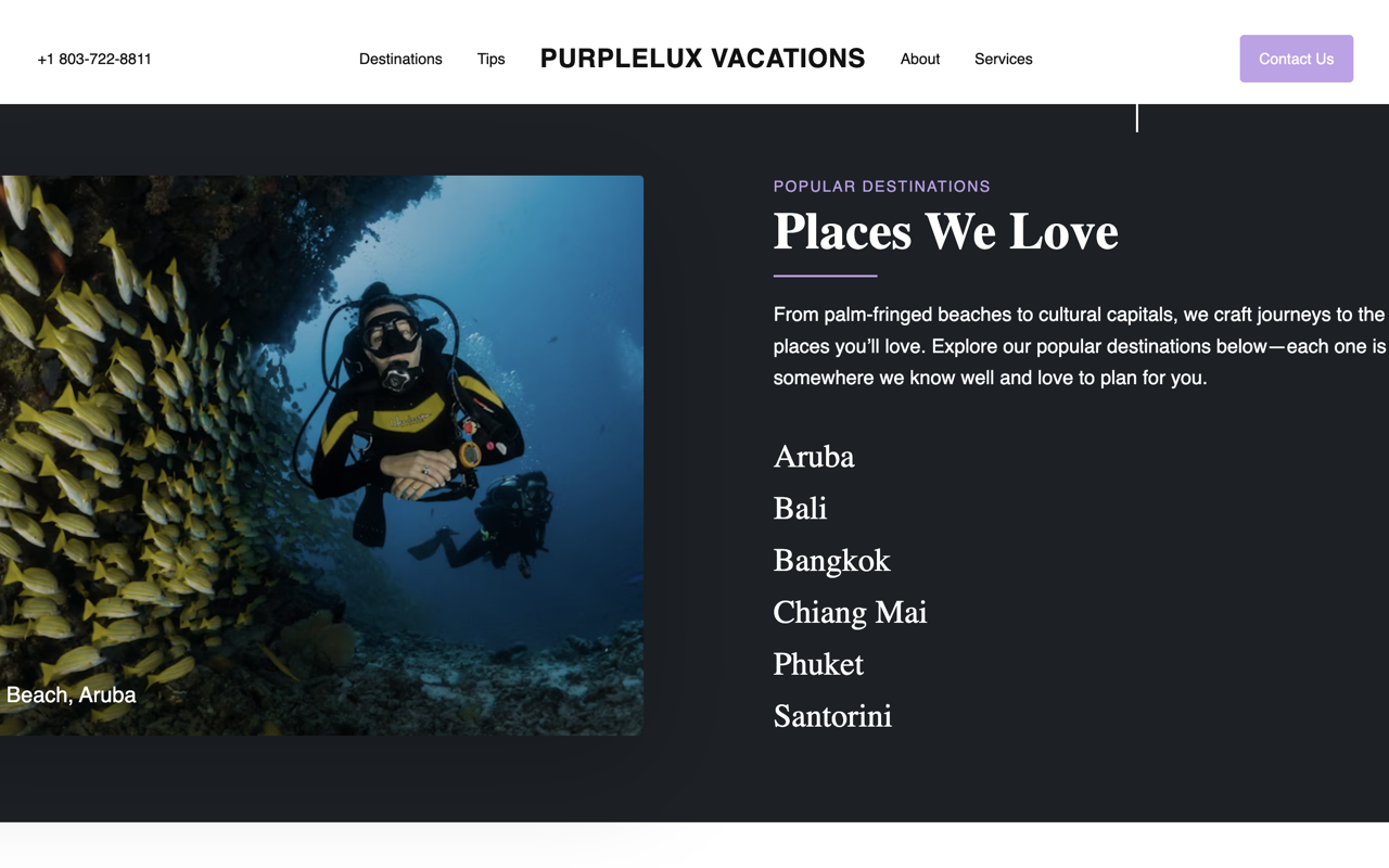
Destination content appears early and visually. Users engage with places first, building interest before encountering logistics or services.
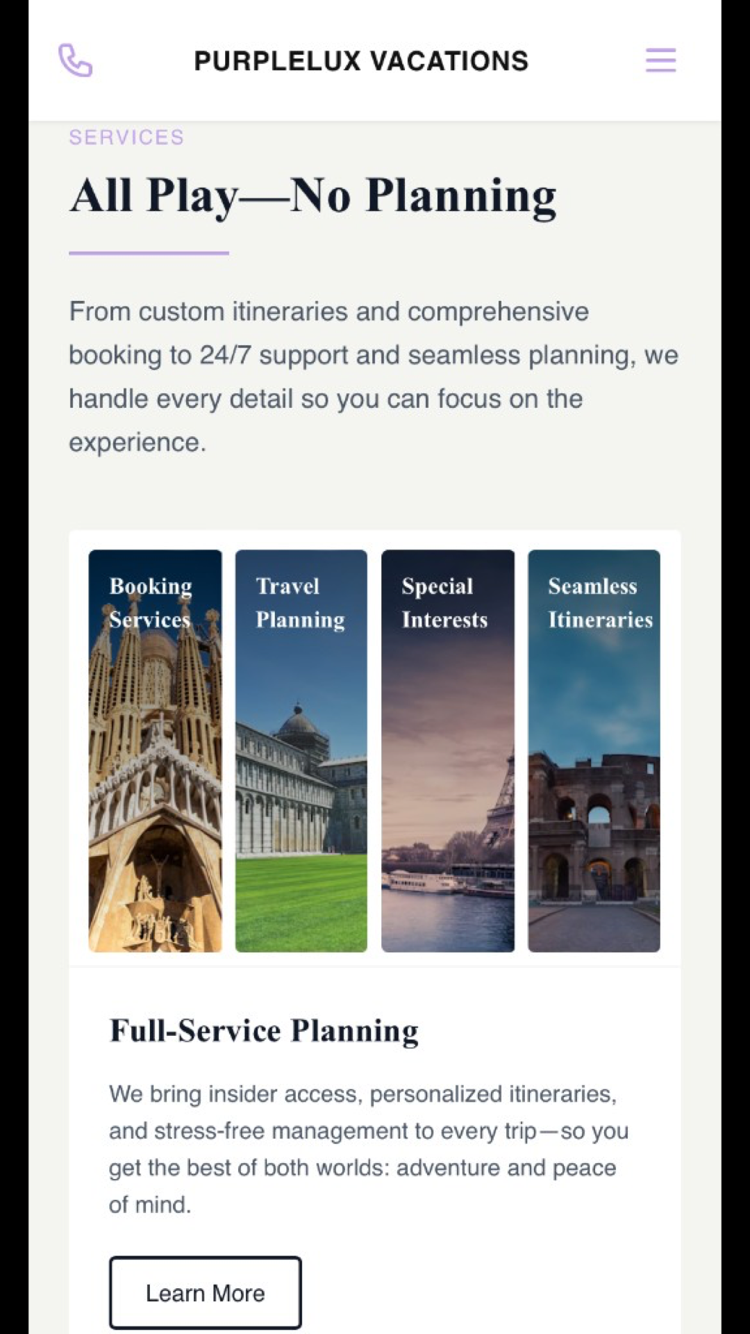
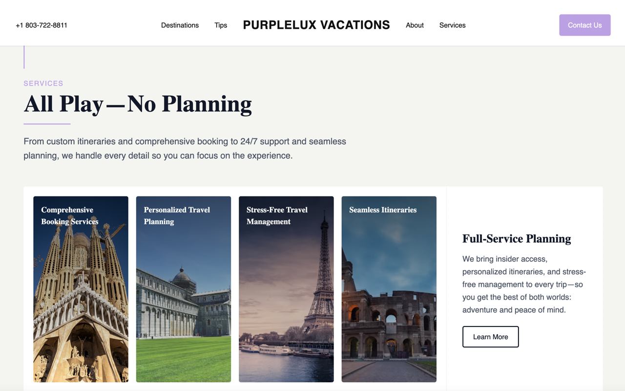
Services are not presented immediately. Instead, they appear after the user understands the value of the experience, aligning the offering with intent rather than interrupting exploration.
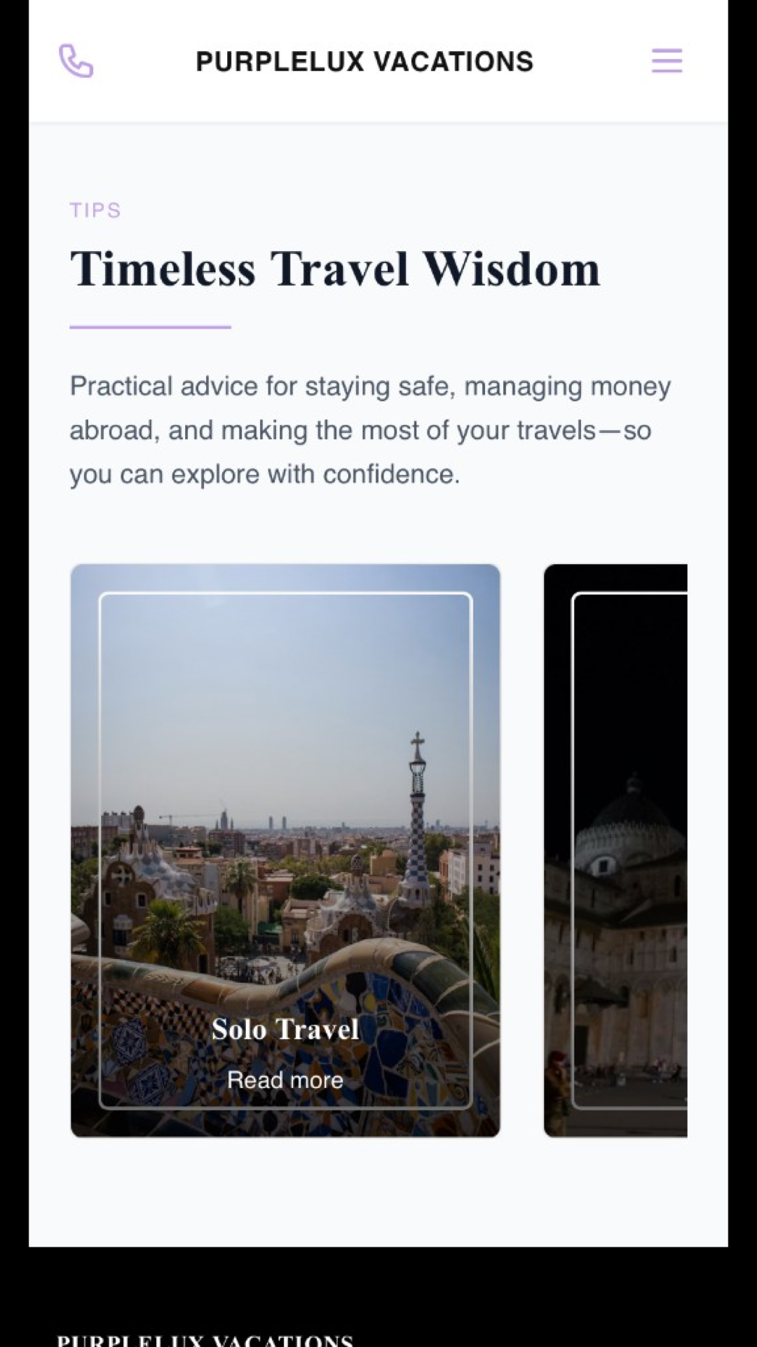
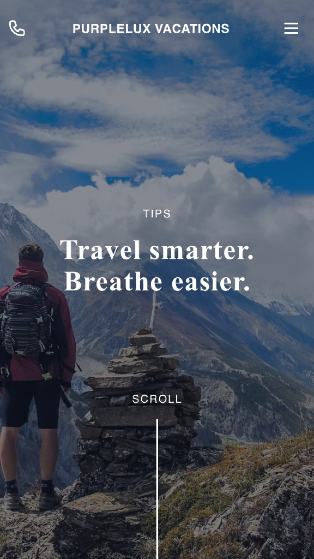
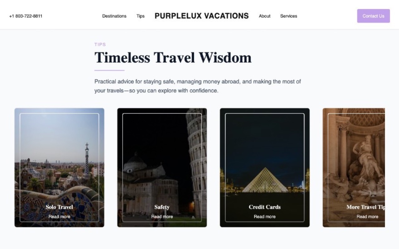
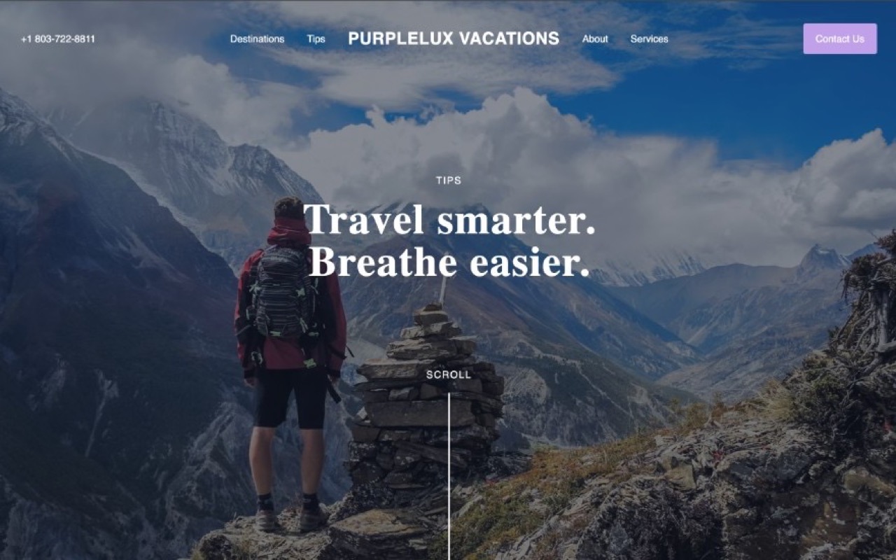
Travel tips and practical guidance are integrated into the experience. This shifts the site from promotional to advisory, positioning PurpleLux as a resource, not just a vendor.
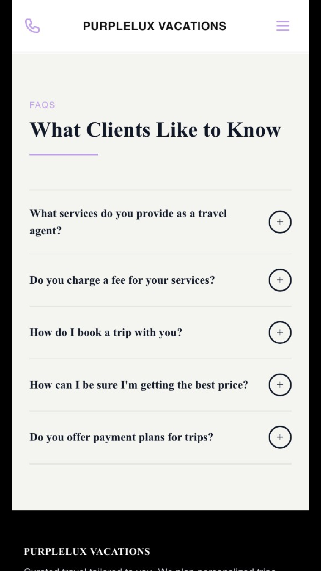
Travel planning isn't linear. People move between inspiration and logistics, back and forth. The site allows for that—keeping orientation intact while users explore in their own order.
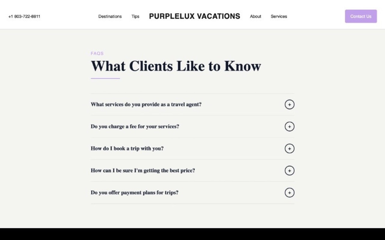
Calls to action are present but not aggressive. By the time users reach them, they've already moved through inspiration and validation, making the decision to engage feel self-directed.
Consistently—in both direct and subtle ways—the site nudges visitors to choose. Beach or city? Relax or explore? This intentional fork in the road invites users to imagine concrete experiences without forcing any real commitment.
Destination content appears early and visually. Users engage with places first, building interest before encountering logistics or services.
Services are not presented immediately. Instead, they appear after the user understands the value of the experience, aligning the offering with intent rather than interrupting exploration.
Travel tips and practical guidance are integrated into the experience. This shifts the site from promotional to advisory, positioning PurpleLux as a resource, not just a vendor.
Travel planning isn't linear. People move between inspiration and logistics, back and forth. The site allows for that—keeping orientation intact while users explore in their own order.
Calls to action are present but not aggressive. By the time users reach them, they've already moved through inspiration and validation, making the decision to engage feel self-directed.